Layout Builder
How to handle with Editor tab
Written By Lukas Pavelka
Last updated 6 days ago
A new structure of selected screen(s) is split into several parts - Screens, Controls, Properties, and Transitions. Let’s look at them deeply.
Screens
If you select frame with a “screen“ prefix, then the name of your selected screen will be visible under this tree.

From version 5.7, when you run/restart the plugin and you have selected a screen or a control, the plugin will load it automatically. Not need to click on “Reload“ button.
On mouse hover of a screen name in plugin, you will see two icons. The left icon represents location of your selected screen. If you click on this icon, Figma will localise it and show a target.

The second icon is a dropdown menu, where you can find these items:
Copy to clipboard - copies YAML code of whole screen to a clipboard
Duplicate - duplicates your selected screen with unique prefixes
Delete - remove your selected screen
If you target your mouse on “Screens“ line in the top, you can add a new screen.

Click on the “+“ button and a popup with layout selection and type of screens will be visible.

On the screen is only one field mandatory - Title. Layout and type is filled in automatically. You can also specify a position where your screen will be located in your Figma page.
List of layouts
Mobile
Tablet
Desktop

List of types
Blank
Calendar
Email
Form
List
Meeting
Scrollable
Success
People
Responsive (only in PRO version)
Split (only in PRO version)
Sidebar (only in PRO version)
Below, you can find an example of Email layout type after selection of the Email type.

Here is the output in Power Apps after exporting to YAML or copying to clipboard.

Responsive
This new feature is only available in PRO version. When you select this type, a frame with responsive inner frames will be visible in your Figma page.

In picture above you can see 4 inner frames:
Screen Container
Header Container
Main Container
Footer Container
Every container control is responsive. Their contain responsive width in YAML code, like this example:

In other words, if the parent screen contains a suffix “_res“ every your frame and frame with auto-layout will have responsive width in YAML code. Like “screen_<screenName>_res“ for example “screen_dashboard_res".
Controls like dropdown, combobox, container, button, slider, table, label, text, fluid, or svg will have responsive width if your screen has suffix “_res“.
In version 5.0 you can use a new suffixes - FH (fixed height), FW (fixed width) which signal for YAML code viewer to reuse height or width of selected control.

If you fight with suffixes, “Generate prefixes“ button also supports generate suffixes if your frame has fixed height or width in Auto layout section:

In version 4.2, the plugin prepare a switch function for font size property with various values for screen layout.

On the picture you can see the value of selected screen for title label with this code:
Size: =Switch(Tasker_res.Size,6,20,5,20,4,18,3,18,2,15,15)This means, that your selected layout size will return particular font size according to your specified size in Figma. More info about sizes values you can read here.
In the last version, containers recognise padding from top, bottom, left, and right. Means, if you have controls in responsive screen under container that has padding, your Width will be calculated.

Warning Dialog
The feature is available from version 4.5 and it is called Warning Dialog. It helps you to check naming of your selected screen. Power Apps does not allow repeated or wrong naming in YAML code.

The warning dialog recognises 2 types of errors:
Repeated text
Wrong name
Power Apps does not support these wrong characters in YAML code:
Emojis
White spaces
Math operators - ‘+‘, ‘-‘, ‘/‘
From latest version of this plugin, you can repair repeated texts through the ‘Repair‘ button. If your name is repeated multiple times, the plugin finds it and replaces all of them.

Plugin will repair your name by adding a random number before your suffix.
Controls
Includes a list of child prefixes included under selected screen or selected node. For example, if you have LBL prefix under screen_dashboard or you select a control with LBL prefix, the controls tree will show a name of your control.

Also selected control contains multiple actions.
Copy to Clipboard - copy YAML code to clipboard
Create Component - create control as component in Figma
Swap - you can change your control by another one
Duplicate - you can duplicate selected control
Remove - removes your control
From version 4.0 you can swap your selected control by another or by icon. Here is the example of how to swap icon:


You can also duplicate your selected control as it is shown on the picture below. 👇

How to ADD control
Click on ‘+‘ button and add these types:
Classic
Modern
Composed
Charts

In this dialog is only Title field mandatory. When you select particular type, you will get the list of available controls.
Classic controls:
Add Media,Audio Player,Barcode Reader,Button,ColumnChart,Combo,Datepicker,
Dropdown,Export,Form,Gallery,Checkbox,Import,Label,LineChart,Listbox,Microphone,
Octagon,Pentagon,PieChart,Radio,Rating,RichText,Slider,Star,Table,Text,Timer,Triangle Angled, Toggle,Video Player,ViewIn3D
Modern controls:
Avatar PCF,Badge PCF,Button PCF,Combo PCF,Datepicker PCF,Dropdown PCF,Form PCF,
Header PCF,InfoButton PCF,Checkbox PCF,Label PCF,Link PCF ,Number Input PCF,
Progress PCF,Radio PCF,Slider PCF,Table PCF,Tablist PCF ,Text PCF,Toggle PCF, Toolbar PCF
Composed controls:
Available only in PRO version
BarChart,Calendar,Feedback Box, Horizontal Menu,Profile Card,Search Field,Stage Box
Charts controls:
Available only in PRO version
Bar chart,Doughnut chart,Line chart,Pie chart,Radar chart,Radial Gauge chart
Charts represent QuickChart.io where a plugin generates a template of particular chart.
After type and control selection, you can enter X and Y positions, where your control will be visualised in Figma.

Icons
Plugin supports add icons for Fluent 8 and Fluent 9. In adding controls ‘+‘ button you can choose icon in menu, where popup dialog with icon library will be shown.

When you select Fluent 8, you will be able to choose all classic icons available in Power Apps. From version 5.1 you can select a first bunch of icons represents in Fluent 9 at this moment. In next version you will see more icons.

Transitions
This functionality is great for documentation. In plugin you can create a dependency model, where is visible all transitions between screens.

What you need is to select a screen, click on “+“ button under Transitions tree, and choose start & target node with transition type.

Please do not remove the arrow between screens directly in Figma!!! Remove it through the plugin. The reason is that plugin saves IDs of selected screens to the storage. If you remove it directly, saved IDs will be still in storage and plugin will not find them anymore!
Properties(Temporary Deactivated)
This feature is temporary deactivated due to preparation of new version!!!
Power Apps for Figma plugin enables to add additional properties for Labels, Buttons, Text Inputs, Radio, Toggle, Combo, Dropdown, and Checkbox. Here is the list of supported properties:
Classic Label
AutoHeight , ContentLanguage , DisplayMode , Live , OnSelect , Overflow , Role , TabIndex , Tooltip , Wrap
Modern Label
AutoHeight , ContentLanguage , DisplayMode , Wrap
Classic Button
AutoDisableOnSelect, ContentLanguage , DisplayMode , OnSelect, TabIndex, Tooltip
Modern Button
AcceptsFocus, AccessibleLabel, Appearance, ContentLanguage, DisplayMode, Layout, OnSelect
Classic Text Input
AccessibleLabel, ContentLanguage, DelayOutput, DisplayMode, EnableSpellCheck, HintText, Mode, OnChange, OnSelect, Reset, Tooltip, VirtualKeyboardMode
Modern Text Input
AccessibleLabel, Appearance, ContentLanguage, DisplayMode, Mode, OnChange, Required, TriggerOutput, Type, ValidationState
Classic Toggle
AccessibleLabel, ContentLanguage, DisplayMode, OnChange, OnCheck, OnSelect, OnUncheck, Reset, TabIndex, Tooltip, TrueText
Modern Toggle
AccessibleLabel, ContentLanguage, OnSelect, ToggleSize
Classic Check
ContentLanguage, DisplayMode, CheckboxSize, OnCheck, OnSelect, OnUncheck, Reset, TabIndex, Tooltip
Modern Check
AccessibleLabel, ContentLanguage, CheckboxSize, DisplayMode, OnSelect
Classic Dropdown
AccessibleLabel, ContentLanguage, DisplayMode, OnChange, OnSelect, Reset, TabIndex, Tooltip
Modern Dropdown
AccessibleLabel, Appearance, ContentLanguage, OnChange, Required, ValidationState
Classic Radio
AccessibleLabel, ContentLanguage, DisplayMode, OnChange, OnSelect, RadioSize, Reset, TabIndex, Tooltip
Modern Radio
AccessibleLabel, ContentLanguage, OnChange, RadioSize, Required
Classic Combo
AccessibleLabel, ContentLanguage, DisplayMode, InputTextPlaceholder, IsSearchable, NoSelectionText, OnChange, OnSelect, Reset, SelectMultiple, TabIndex, Tooltip
Modern Combo
AccessibleLabel, Appearance, ContentLanguage, InputTextPlaceholder, IsSearchable, MultiValueDelimiter, OnChange, Required, SelectMultiple, ValidationState
Modern Avatar
Appearance, Badge, OutOfOffice, Shape
Modern Badge
DisplayMode, Content, OnChange, Shape
Modern DatePicker
AccessibleLabel, Appearance, IsEditable, OnChange, ValidationState
Modern Form
AcceptsFocus, ContentLanguage, DefaultMode, OnSuccess, OnFailure, OnReset
Modern Header
AccessibleLabel, Appearance, DisplayMode, IsLogoVisible, IsProfilePictureVisible, IsTitleVisible, LogoToolTip , OnSelectLogo
Modern InfoButton
AccessibleLabel, AcceptsFocus, Appearance, DisplayMode, IconSize, OnSelect
Modern Link
AccessibleLabel , AcceptsFocus, Appearance, DisplayMode, OnSelect, URL
More info about these properties you can reach on official Microsoft documentation.
After created property for particular control, you are able to edit or remove it.

Compile
Create a frame on Figma page, add some Figma controls, like Text, Autolayout, Ellipse, or others, and click on “Compile“ button. The plugin will generate mentioned prefixes in names of your controls. From version 5.0 the plugin also supports generate suffixes ‘_fix’, ‘_fh’, ‘_fw’.

In version 5.1 you do not need to have any created prefixes. The plugin automatically recognise a suitable prefix and suffix according to selected control in Figma page.
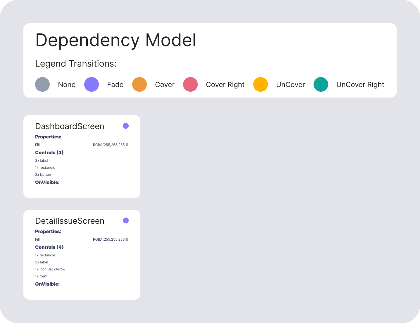
Dependency Model
The feature is only available in PRO version
During importing of Solution file or particular YAML's files you can include dependencies between Power Apps Screens.
How it works?
In Power Apps editor you can specify Navigate function under OnSelect property for every Power Apps control.
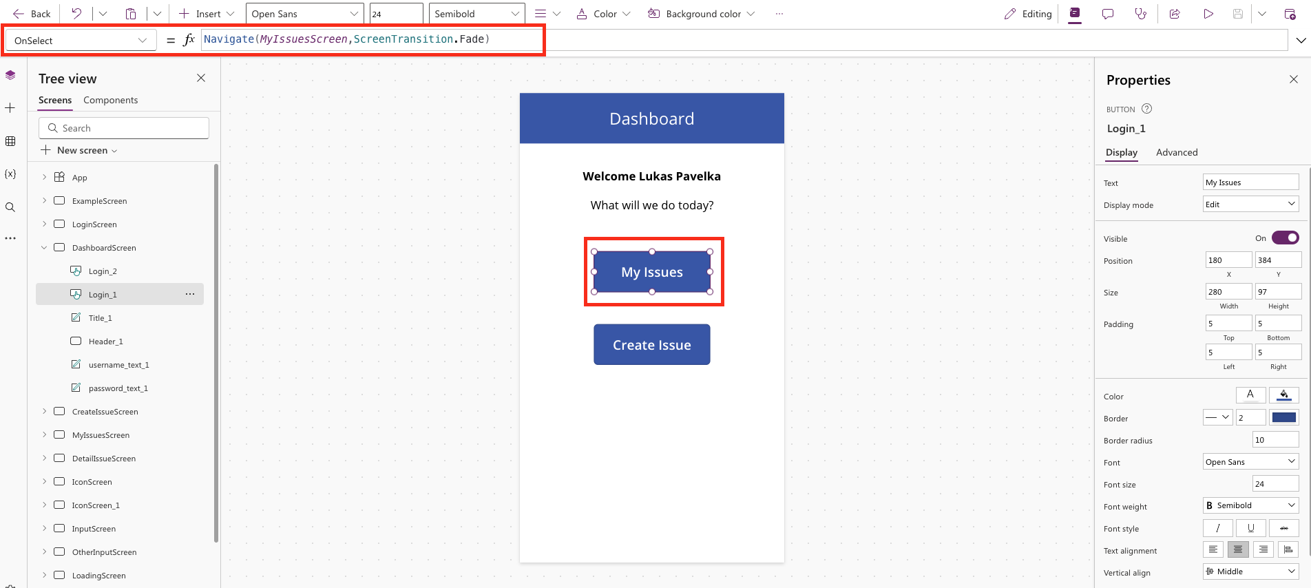
When you do this and activate Dependency Model in Power Apps for Figma plugin, under Settings tab, you will see all dependencies in Figma.

Imported Dependency Model in Figma
Export to PDF
The feature is only available in PRO version
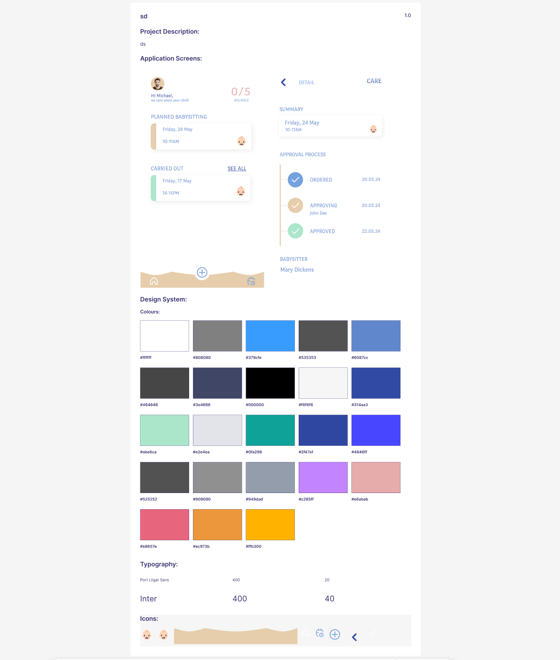
When you select a screen or multiple screens you can choose “Export PDF” menu item in the split button. Then you need to fill title and description (optional) to generate documentation of your project.

The output file will be as exported to PDF as collected on the Figma page. The export contains:
Project name
Project description
Screens
Dependency Model (if it was selected)
Power Automate Flow(s) (If it was selected)
Design system - colors, icons, typography
Resize mobile/tablet
In the last version, plugin is able to resize your selected screen. There are 2 conditions:
Only 1 selected screen is possible to resize
Only screen with prefix “screen_“ is possible to resize
After clicking on “Resize mobile/tablet“ your screen will be resized. When you click again, your screen will be resized back to original layout.

Translate
This cool feature is great for translating to various combination of your app for bilingual users. Plugin contains 108 languages.
"Afrikaans","Albanian","Amharic","Arabic","Armenian","Azerbaijani" ,"Basque","Belarusian","Bengali","Bosnian","Bulgarian",
"Catalan","Cebuano","Chinese (Simplified)","Corsican","Croatian","Czech","Danish","Dutch","English"
"Esperanto","Estonian","Finnish","French","Frisian","Galician","Georgian","German","Greek","Gujarati" ,"Haitian
Creole","Hausa","Hawaiian","Hebrew","Hindi","Hmong","Hungarian","Icelandic","Igbo","Indonesian","Irish","Italian","Japanese","Javanese"
"Kannada","Kazakh","Khmer","Kinyarwanda","Korean","Kurdish","Kyrgyz","Lao" ,"Latin","Latvian","Lithuanian","Luxembourgish"
"Macedonian","Malagasy","Malay","Malayalam","Maltese","Maori","Marathi","Mongolian","Myanmar (Burmese)”,"Nepali","Norwegian"
"Nyanja (Chichewa)","Odia (Oriya)", "Pashto","Persian","Polish","Portuguese","Punjabi","Romanian"
"Russian","Samoan","Scots Gaelic","Serbian","Sesotho","Shona","Sindhi" ,"Sinhala","Slovak","Slovenian","Somali","Spanish","Sundanese"
"Swahili","Swedish","Tagalog (Filipino)","Tajik","Tamil","Tatar","Telugu","Thai","Turkish"
"Turkmen","Ukrainian","Urdu","Uyghur","Uzbek","Vietnamese","Welsh","Xhosa"
"Yiddish","Yoruba","Zulu"

Bulk Manager
This feature is only available in PRO version!!!
This feature allows you to change prefix/suffix of your selected nodes in Figma file. Or you can find some word and replace it with another one.

How it works?
Go to Editor tab, select a “Bulk Manager“ item in split button, choose your node, and click on “Bulk Manager“ button. Then a dialog will appear and you can choose these options:
change prefixes - your prefixes will be replaced by your selected
change suffixes - your suffixes will be replaced by your selected
find replace all - your searched word will be replaced by your provided
For example, if you have btn_ prefix and you want to change it to btnpcf_ from the dialog, all these prefixes will be replaced by btnpcf_.
